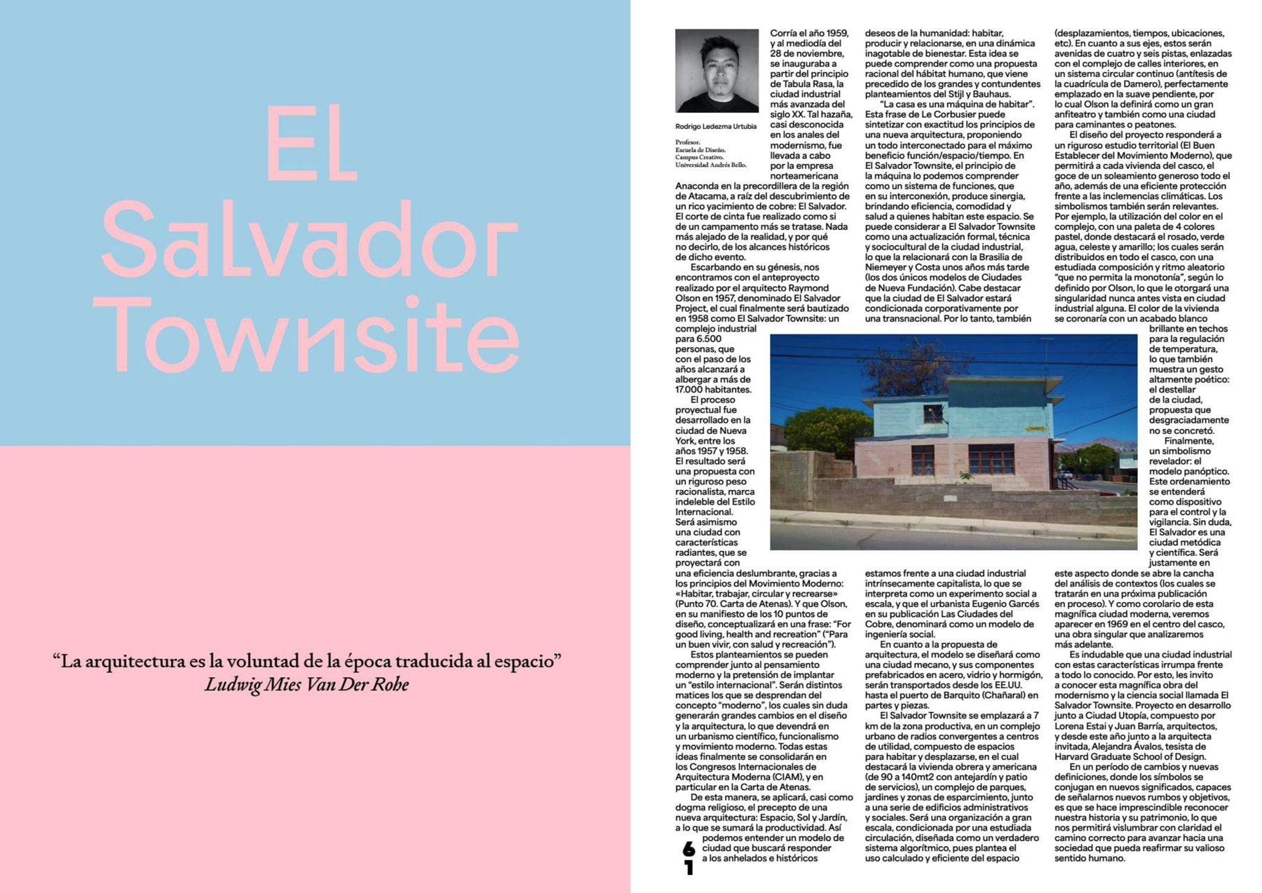
Area is a variable font family of 88 fonts. Revolving around two width: Normal and Extended, matching italics. Two styles: Normal and Inktrap, matching italics. Taking full advantage of the variable technology in order to bring a powerful font system. Like any piece of architecture, the design process of Area started with a stable modular geometrical structure. Once the foundations are laid, its envelope slowly unfolds into a more quiet neogrotesque robe, offering a solid base for any reading experience thanks to its smooth grey. Far from being ornamental, Area inktraps have been planned from A to Z to offer the assurance that even in situations that are trickier and require the use of smaller text, everything will remain steady as well.
Being able to provide great tools for designers to work with is one of the foundry’s core of action. It was a pretty straightforward decision to answer what seemed to be their users demands for a sans typeface. One which would be more reader-friendly — and thus being able to be paired with their other fonts.
But don’t fool yourself though : Area being a bit quieter doesn’t mean Blaze Type put aside what has always been at the very core of the foundry : designing graphical and impacting shapes. It possesses the possibility of becoming quite stranger through numerous alternates and different axes in the variable version.
The disturbance that while everything around you looks normal, being here by yourself makes every turn around a corner a call for surprise. The mystery of the seven stars which thou sawest in my right hand, and the seven golden candlesticks.
The seven stars are the angels of the seven churches: and the seven candlesticks which thou sawest are the seven churches.The mystery of the seven stars which thou sawest in my right hand, and the seven golden candlesticks. The seven stars are the angels of the seven churches: and the seven candlesticks which thou sawest are the seven churches.
Behold, he cometh with clouds; and every eye shall see him, and they also which pierced him: and all kindreds of the earth shall wail because of him. And in the midst of the seven candlesticks one like unto the Son of man, clothed with a garment down to the foot, and girt about the paps with a golden girdle.
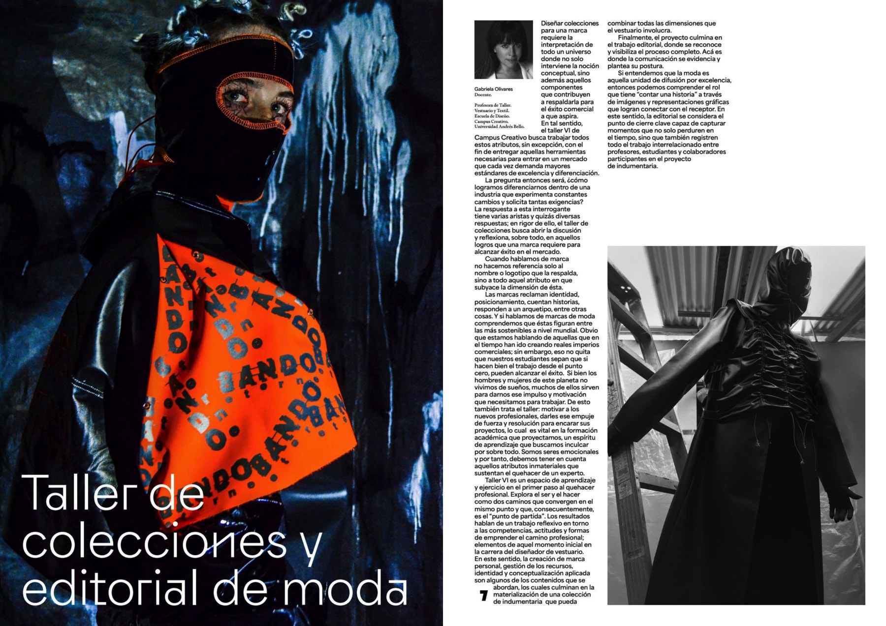
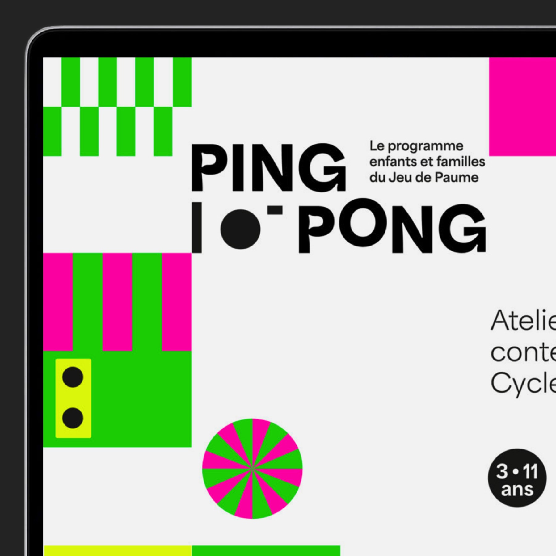
1/3A few example of Area combined with other cool fonts, including some of Blaze’s type finest
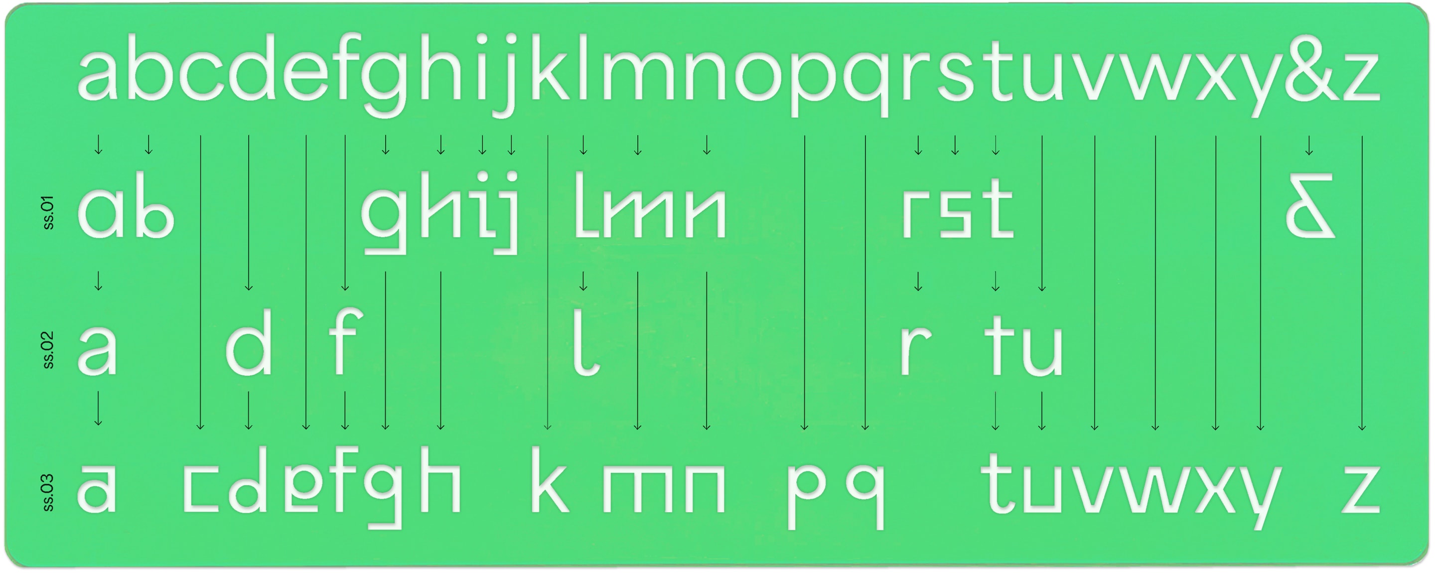
3 With alternate glyphs for almost all letters, Area is a playground to experiment with :
See alternates
In Area, every lowercase benefits at least one alternate version, which are clear references to Paul Renner’s original Futura drawings. A particular graphical experiment from the late 20’s where each letter became a pretext for a normograph driven invention. Aside from being a body text driven typeface, Area is also meant to be a toolbox allowing the composition of unlikely optical greys, or impacting and strong designs.
The goal with Area is to give designers something to play with, and make them feel excited by going through a large glyphset with a surprising content. The whole concept of area must be seen as space of freedom, a blank space. A place welcoming designs to be built on, like the blank page of a layout.
Area alternates, inspired by Paul Renner’s normographs experiments
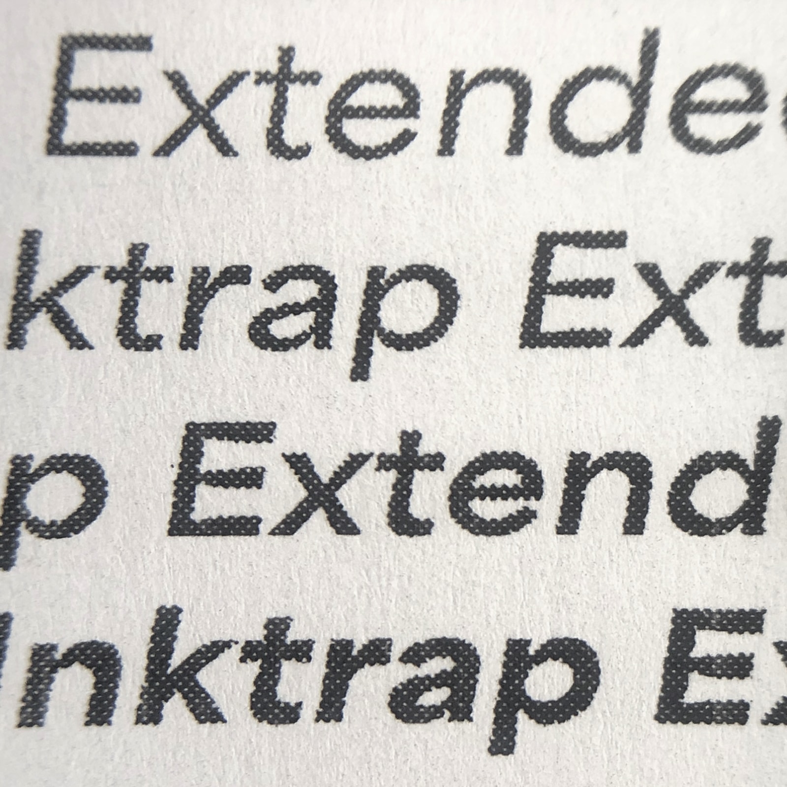
4 The inktrap version assures high legibility in all sizes :
In this family, each weight comes with an inktrap version. While we can observe an inktrap resurgence in the type design market during the past few years — sometimes for the sole purpose of its aesthetics value (which is a great thing) — Area inktraps are first and foremost a crucial technical element : “essential” for whoever wants to design legible typeface in tiny sizes.
Our brain’s ability to interpret what it thinks it is observing through the eyes is mesmerizing. It may be an amazing biologic machine, bit it’s consistently lying to us. Blurring tiny details, especially in small size fonts. Even though inktraps are not designed in the same sense as before, where they would — as the name goes — trap ink, our eyes still compensate that tiny gap in small sizes which allow us to have a decent reading with fonts designed for that challenge.
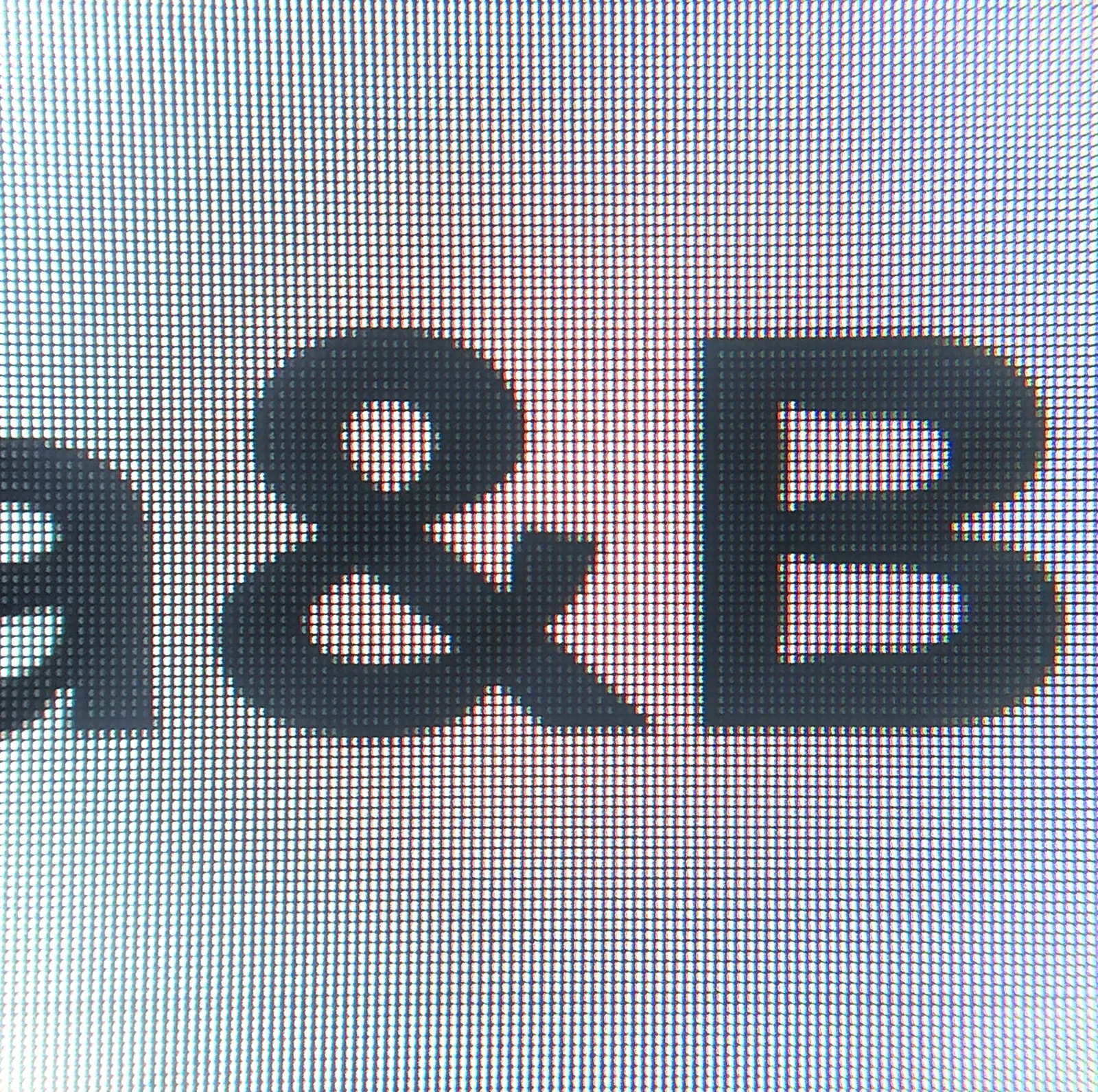
Printed details, size 4ptDetail on screen, size 6px
Moving forward with a machete
Each letter
was designed to
work by itself
5 Area will cover every needs for digital interface design :
Area was primarily designed for digital interfaces, which require a readable character set which can be read in small or even very small sizes thanks to the inktrap version. The whole family is made up of 88 fonts, revolving around two width : Normal and Extended, each with matching italics.
By taking full advantage of the variable technology in order to bring a powerful font system, it is meant to fulfil every needs a project might have. But even if it was intended for digital and text mayout, every foundry knows and likes to be surprised by the uses that are made of their fonts.